I’ve tackled massive walls before—they’re intimidating at first.
Try hanging oversized artwork as your main anchor, or build a gallery wall if you’re feeling creative.
A statement mirror bounces light beautifully.
Full-wall shelving works wonders for storage plus style.
Paint an accent wall in bold color, layer wallpaper for texture, or style a console table below.
Don’t forget lighting—it changes the room.
Coordinate colors with your furniture and rug so nothing fights for attention.
Each approach has its own benefit waiting to unfold.
Hang Oversized Artwork as Your Primary Focal Point
How do you fill a massive wall without making it look bare or cluttered? Hanging a single oversized artwork creates an immediate visual impact that changes your entire room. One large piece serves as your primary focal point, drawing everyone’s eyes straight to it.
Here’s what works: choose artwork that’s genuinely substantial—we’re talking something that commands attention. Center it on your wall where you can view it comfortably from your main seating area. I recommend pairing this bold piece with proportional furnishings nearby, like a console table or credenza beneath it.
The key is restraint. Resist the urge to fill surrounding wall space with smaller pieces. Instead, let your oversized artwork have space around it. This approach creates sophistication without overwhelming your space.
Build a Gallery Wall to Showcase Personality and Color

If you’re staring at a blank wall and thinking “I need something more interesting than one giant painting,” a gallery wall might be your answer—and I’ll admit, I’ve learned this the hard way after hanging too many pieces haphazardly. The key is being strategic about which pieces you choose and how you arrange them so they actually work together instead of looking like you just threw darts at the wall. Once you nail the curation and layout, you’ll have a focal wall that tells your story and brings personality to the room.
Curating Art Collections Strategically
Why settle for a single painting when you can tell your whole story on one wall? I’ve learned that curating a gallery wall strategically means mixing what speaks to you personally with pieces that simply look great together. Start by selecting a central artwork—your favorite piece or photo—then layer smaller works around it. Don’t overthink matching frames; instead, embrace variety while keeping a consistent color palette. I arrange prints, travel souvenirs, and family photos in deliberate rhythms, spacing them evenly to avoid chaos. Before committing to holes in your wall, I lay everything out on the floor first. This lets me test sightlines and verify each piece feels purposeful. Your gallery wall should reflect who you are—quirks included.
Arranging Pieces For Visual Impact
Once you’ve picked your pieces, the real fun begins—arranging them so they actually grab attention instead of looking like you threw darts at the wall. I start by anchoring my gallery with one large piece or two oversized works as the main focus. Then I flank these with smaller pieces, creating rhythm and balance that actually works.
Here’s my approach: I vary mediums and colors deliberately. Bold paintings next to black-and-white photos, textured prints mixed with minimalist frames—this contrast keeps your eye moving across the wall. I space each piece consistently, like I’m creating a visual conversation rather than random clutter.
Before committing, I view my arrangement from your main seating area and check ceiling height proportions. This keeps your gallery looking planned, not cramped.
Curate Collections on Floating Shelves

Looking for a way to display what matters most on your walls? Floating shelves offer a practical solution. I’ve found they work well for showing off books, plants, family photos, and cherished keepsakes all in one spot.
The key is mixing different items with intention. Don’t just line up identical objects; instead, vary heights and textures. A tall plant next to a stack of books beside framed photos creates visual interest without feeling crowded.
What I appreciate most? You can refresh everything whenever you want. Found a new collectible? Rearrange. Tired of the current look? Switch it up. Floating shelves adapt as your style evolves, making them flexible for growing collections and changing tastes.
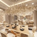
Position a Statement Mirror to Reflect Light and Space

While floating shelves let you curate what you want to showcase, a statement mirror does something equally powerful—it works for you without requiring any styling at all. A bold, oversized mirror reflects natural light and makes your seating area feel more spacious. You can go solo with one mirror or pair two large mirrors for added depth and symmetry. The frame matters too—choose styles matching your furniture, whether that’s mid-century wood, glam metallic, or minimalist black. Position yours to catch window light while avoiding reflections of clutter or your TV. If your ceiling allows it, a tall, full-length mirror maximizes vertical presence.
Paint an Accent Wall in Bold, Complementary Color

I’ve learned that picking the right bold color for your accent wall is half the battle—you’ll want to choose a hue that’s vibrant enough to grab attention but won’t clash with what’s already in your space, so consider pulling inspiration from your rug, furniture, or curtains before you commit. Once you’ve settled on your color, I’d make sure it actually complements the surrounding elements rather than fights against them; this means checking how that dusty rose or olive green plays with your existing décor in different lighting before you crack open a paint can. The payoff is worth the planning because a well-coordinated accent wall looks deliberate and can make your whole room feel taller and more spacious, which is practical when you’re working with a large wall that needs some personality.
Bold Color Selection Strategy
Want to refresh a massive living room wall without overhauling your entire design? Choosing the right bold color matters. You’ll want to decide whether you’re echoing your rug’s palette or contrasting with room neutrals. Here’s what I consider:
| Color Option | Best For | Impact Level | Coordination Tip |
|---|---|---|---|
| Dusty pink | Subtle intrigue | Medium | Pairs with warm textiles |
| Bright azure | High drama | High | Complements cool furniture |
| Deep emerald | Sophisticated depth | High | Works with brass accents |
| Warm terracotta | Earthy balance | Medium | Echoes natural textures |
I always assess my room’s lighting first. High ceilings and abundant natural light? Go bolder—your accent wall won’t disappear. Pair your chosen color with existing curtains and furniture finishes that share the same color family. This coordination keeps everything feeling deliberate rather than chaotic.
Complementary Palette Coordination
How do you actually turn one bold color into a design move that doesn’t feel random or jarring? The approach is coordinating your accent wall with everything else in the room. Picking dusty rose or pale pink creates subtle harmony, while bright azure or olive green delivers dramatic contrast in a white space.
Here’s what matters: your accent wall must talk to your art, rug, and curtains. Think of them as a conversation where everyone’s speaking the same design language. Keep it simple by limiting boldness to one wall only—resist the temptation to paint multiple walls competing colors.
Check your room’s natural light and ceiling height too. These factors determine whether your bold color enhances the space or overwhelms it.
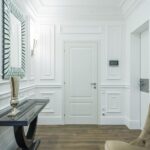
Style a Console Table as a Secondary Wall Feature

When you’ve got a massive wall staring back at you, a console table can serve as a practical anchor for creating visual balance and depth. Pairing it with one bold centerpiece—whether that’s a statement mirror, sculpture, or stack of accent books—draws the eye without overwhelming the space.
Thoughtful layering matters. Add lamps or sconces above to illuminate your vignette and create dimension. Below the surface, use drawers or baskets to hide clutter while displaying curated plants and candles.
What matters most: scale compatibility. Your console shouldn’t tower above its surroundings. Leave breathing room between it and your wall art.
| Element | Purpose |
|---|---|
| Bold centerpiece | Creates focal point |
| Lighting | Adds depth and warmth |
| Storage | Manages clutter |
| Plant arrangement | Softens design |
Create Impact With Full-Wall Shelving

Full-wall shelving uses empty wall space for storage and display without taking up floor room. A modular system like Room & Board’s 80-unit shelving works well—at 12 inches deep, it won’t reduce your usable space. The key? Leave some shelves partially empty. Mix books with plants and decorative objects, positioning them off-center for visual balance.
Before installing, outline everything with painter’s tape on your walls. This helps you avoid mistakes. Match your shelving’s size to your room’s dimensions and proportions. Done properly, you’ll have a personal focal point that shows who you are.
Layer Wallpaper or Texture for Tactile Depth

While shelving gives you a structured way to showcase your belongings, wallpaper and textured finishes take a different approach—they redefine the wall itself as a design statement. I’d recommend starting with a single feature wall behind your sofa. It’s the perfect testing ground before committing to an entire room.
Peel-and-stick wallpaper options let you experiment without permanent decisions. Choose patterns that appeal to you and coordinate with your furniture. Textured wallpapers add dimension that flat paint simply can’t match.
Here’s what matters: balance is everything. Layer in lighter art and furnishings so your wall enhances rather than overwhelms the space. As your style evolves, you can easily swap designs. This flexibility means you’re not locked into yesterday’s choices—you’re building a space that grows with you.
Coordinate Your Wall With Furniture and Color Palette

Once you’ve picked your wall feature—whether it’s a bold artwork or TV—the key is to tie it all together with a complementary rug and a thoughtful color palette. Your rug acts like a bridge between that statement wall and your furniture, so choose one that echoes the wall’s colors and feels proportional to your seating area. From there, balance everything by selecting furniture pieces and curtains that support your wall without competing with it, keeping your accent feature as the primary focus.
Choose A Complementary Rug
A rug isn’t just something you throw down to cover bare floor—it’s actually one of your best tools for tying your whole room together. Selecting the right rug anchors your wall feature and creates visual harmony throughout the space.
Here’s what to focus on:
- Echo dominant colors from your wall art or accent wall in the rug’s palette
- Balance boldness with neutral furniture to avoid overwhelming the room
- Repeat key colors in accessories or upholstery for cohesive design
- Choose unifying tones over competing patterns when featuring dramatic artwork
The trick is sizing your rug to define the room’s center and create depth. Pull furniture slightly away from walls, letting the rug anchor everything together. Your wall feature deserves a supporting player, not a rival.
Select Cohesive Color Palettes
How do you keep your wall feature from clashing with everything else you’ve already got in the room? I start by choosing a cohesive color palette that ties my wall to existing furniture and textiles. I pick a dominant color or large-scale art in the same tonal family—think dusty rose with pale pink or olive green with neutrals—creating subtle depth without visual chaos.
| Element | Color Strategy |
|---|---|
| Wall | Dominant tonal family |
| Rug | Echo wall palette |
| Curtains | Reinforce continuity |
I use rugs, curtains, and seating fabrics that echo my wall’s palette, reinforcing balance across the room. Before committing, I test color relationships using swatches or a mock layout on the floor. This prevents expensive mistakes and helps your space feel intentionally designed rather than accidentally mismatched.
Balance Scale With Furniture
Now that you’ve nailed down your color story, it’s time to make sure your furniture actually plays along with that wall feature you’ve created. Here’s what works:
- Pull furniture away from walls to create breathing room and let your wall space shine
- Use end tables with lamps to frame seating and bounce light around the room
- Choose a rug that connects your wall feature to furniture, anchoring everything together
- Align seating to face your primary wall feature for clear sightlines
The trick? Match your furniture scale to your wall treatment. Undersized pieces make grand walls feel awkward, while oversized furniture overwhelms smaller spaces. Think of it like a conversation—your furniture and wall should complement each other, not compete.
Light Your Wall Design to Highlight Every Detail

Why settle for a beautiful wall that disappears into shadows when the right lighting can highlight every detail? Layered lighting makes a real difference. I mount a picture light above my focal artwork to create that museum-quality glow that makes guests stop and look.
I combine task lighting with ambient sources to sculpt depth and emphasize texture. Wall sconces work well when aligned with your vignette, providing balanced, indirect light without annoying glare. If you’re worried about electrical work like I was, plug-in picture lights are a practical solution—no drilling required.
I strategically place lamps on end tables to frame my wall design. This three-part approach—task, ambient, and accent lighting—creates dimension that flat lighting can’t match. Your wall will look its best with proper lighting.