
I’ve found that updating your kitchen doesn’t require gutting everything—it’s about making intentional choices that actually work for how you live. Start with a neutral foundation, then layer in personality through gallery walls featuring your favorite dishes and family recipes. Use texture strategically around functional zones like islands, add one bold focal point (think a vibrant backsplash), and balance it with restraint elsewhere. Brass hardware and natural wood tie everything together cohesively. The key is blending bold character with practicality, creating a space that tells your culinary story while staying modern and livable. Stick around for the specific tactics that’ll show you exactly how to pull this off.
Define Your Modern Kitchen Aesthetic: Minimalist or Eclectic
How do you want your kitchen to feel?
Your aesthetic choice sets the tone for everything else. I’d pick minimalist if you crave calm and efficiency—think clean lines, neutral colors, and hidden storage that keeps things serene. You’ll love the uncluttered surfaces and light palettes of whites and soft greys.
But if you’re like me and want your kitchen to tell your story, eclectic’s your jam. Mix bold backsplashes with natural wood, add plants, embrace varied textures. It’s messier, sure, but it feels alive.
Here’s the real talk: align your aesthetic with how you actually use the space. Minimalist works when you value order. Eclectic thrives when personality matters more than perfection. Neither’s wrong—they’re just different ways of making your kitchen yours.
Start With a Neutral Foundation, Then Build Personal Layers

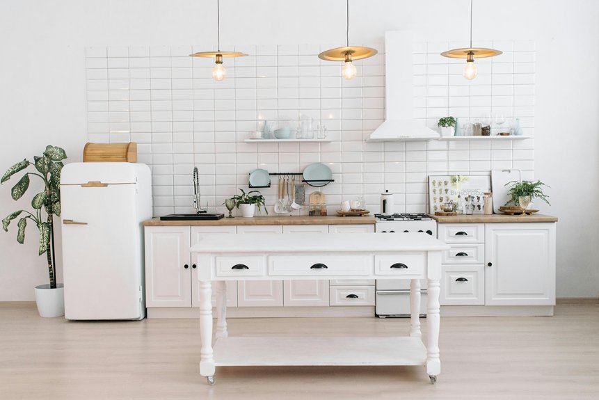
I’ve learned that the foundation of a kitchen I actually enjoy living in starts with keeping things simple—think white, beige, soft grey, and sand tones paired with matte cabinets and wood shelves—so I’m not fighting against busy backgrounds when I want to add personality later. From there, I layer in warmth with natural textures like light wood accents, brass hardware, and soft textiles that make the space feel lived-in rather than sterile. The balance comes when I use small pops of color through accessories and plants instead of painting entire walls, which keeps everything calm while still letting my style come through.
Neutral Palette Foundation Strategy
Why do so many modern kitchens start with the same basic color recipe? Because a neutral palette works. I’ve found that whites, beiges, soft greys, and sand tones create a cohesive backdrop for everything else you’ll add later. This foundation is strategic.
Here’s what I do: I pair these neutrals with light cabinetry and wooden shelves to build breathing room. The key is balancing warm neutrals against cooler tones, which keeps the space from feeling flat. This approach lets me layer in personality through plants, ceramics, and textiles without overwhelming the room.
Think of your neutral palette as a blank canvas. You’re not locking yourself in—you’re creating flexibility. Future updates and seasonal accents slip in naturally because you’ve built a solid foundation that adapts.
Layering Personal Style Elements
Once you’ve got that neutral foundation locked in place, the real fun starts—and honestly, this is where most people get nervous.
Now you’re ready to layer in what makes your kitchen *yours*. Here’s how I’d approach it:
- Display meaningful items – Arrange wall art and favorite cookbooks on open shelves to showcase your culinary story
- Mix textures thoughtfully – Combine wood, stone, and ceramic with soft textiles that warm up the space
- Balance boldly and carefully – Add personal touches like statement backsplashes and decorative plates, then offset them with clear storage jars and uncluttered counters
The trick? Don’t overthink it. Your kitchen should reflect who you are without feeling chaotic. Start small, add gradually, and adjust as you go.
Curate Art Prints That Reflect Your Culinary Story

I’ve found that the prints I hang in my kitchen aren’t just decoration—they’re snapshots of who I am as a cook and eater, whether that’s a watercolor of my grandmother’s famous soup or an abstract piece that reminds me of farmers market mornings. Gallery walls work well here because they let you mix different styles and subjects together, creating a visual story that’s more interesting than a single framed recipe. The key is choosing imagery that actually makes you happy when you’re chopping vegetables or waiting for coffee to brew, not just what looks polished online.
Personalize With Meaningful Imagery
Your kitchen’s walls don’t have to stay blank—they’re the perfect canvas to celebrate what actually matters to you. Meaningful imagery makes a space feel like yours.
Here’s how I personalize my kitchen:
- Display art prints of favorite dishes – I hung a print of my grandmother’s lasagna recipe, and it makes me smile every time I cook.
- Create a gallery wall with mixed styles – I blend abstract pieces with botanical prints and culinary illustrations. This mix shows who I actually am, not some magazine version.
- Lean prints among personal items – I prop art against shelves alongside cookbooks and ceramic collections, creating that lived-in warmth.
Rotate pieces seasonally to keep things fresh while maintaining your story.
Gallery Walls Tell Stories
Gallery walls tell stories through layered curation—they’re a personal exhibition of your interests and passions. I mix abstract prints, botanical illustrations, and culinary artwork to create a display that generates conversation. The key is blending different piece types with intention.
| Element | Purpose | Example |
|---|---|---|
| Central anchor piece | Draws the eye | Large botanical print with picture light |
| Mixed media | Adds depth | Photographs alongside prints |
| Personal items | Builds warmth | Ceramic collections and cookbooks |
| Varied frames | Creates unity | Similar colors, different styles |
I rotate pieces seasonally to keep the storytelling fresh and engaging. By anchoring a large central piece with lighting, I emphasize the gallery as a designed centerpiece. Thoughtful spacing prevents clutter while ensuring each artwork contributes meaningfully to your culinary narrative. This approach lets you build something that reflects what matters to you.
Create Gallery Walls Without Visual Chaos

How do you fill a blank kitchen wall with art without it looking like a visual explosion? It’s all about intentional choices.
Here’s what keeps my gallery wall from overwhelming the space:
- Balance scale and spacing – I mix large statement pieces with smaller prints, leaving breathing room between frames so nothing feels cramped or chaotic.
- Use cohesive groupings – I anchor pieces with a unifying theme, whether that’s botanical illustrations or culinary art, then vary frame styles within that narrative to add visual interest without confusion.
- Rotate periodically – Swapping out pieces every few months refreshes the look without requiring a complete redesign.
Strategic picture lighting highlights key pieces and brings depth to the wall. The result? A gallery wall that looks deliberate and organized rather than cluttered.
Add Contemporary Edge With Abstract Pieces and Gold Accents

When’s the last time you walked into a kitchen and felt drawn to the walls? That’s where abstract art comes in. Bold, fluid forms create a contemporary edge—especially when paired with gold accents in frames or hardware. It gives your kitchen a confident personality without demanding attention.
The approach? Choose pieces that share your kitchen’s existing color palette. Stick with neutrals and metallics so everything feels deliberate, not haphazard. Abstract art works well in unexpected spots—above the sink, beside cabinets, even in corners. These pieces spark conversation while balancing modern and traditional elements.
One useful option: rotate your prints seasonally. It keeps things fresh while maintaining that gallery feel most people want. Your kitchen changes with the seasons and your mood, without requiring major renovation.
Use Texture and Pattern to Prevent Sterile Minimalism

Here’s the fact about modern minimalism—it can feel cold fast.
I’ve learned that texture and pattern prevent sterile spaces in kitchens. You’ll want to layer strategically:
- Mix tactile materials—combine rough stone backsplashes with smooth glass jars and warm wood shelving to create visual interest while staying cohesive.
- Introduce subtle patterns—try geometric tiles, patterned backsplashes, or fabric curtains that enrich without overwhelming your modern kitchen decor.
- Balance with consistency—use brass hardware, matte finishes, and natural wood throughout so your texture choices work together rather than clash.
The approach? Focus texture around functional zones like islands and open shelves. This keeps your space both modern and livable. You’re not just decorating—you’re building a kitchen that works for daily life.
Balance Bold Colors and Vintage Character With Modern Restraint

What if you could actually pull off that jewel-tone backsplash you’ve been dreaming about without turning your kitchen into a thrift store explosion?
I’ve learned that balancing bold colors with vintage character requires modern restraint. The trick? Pick one focal point—maybe that panda quartzite island or a vibrant backsplash—then keep everything else neutral. This approach prevents visual chaos.
I anchor bold elements with brass or black hardware, which ties everything together beautifully. Then I layer textures: warm wood, matte finishes, and glass jars create depth without clutter.
Open shelving displays vintage kitchenware and curated plates sparingly—not crammed together. Each piece feels deliberate.
This strategy lets you embrace bold colors and vintage character while maintaining that modern, considered feel your kitchen deserves.